
Our New Pressmark
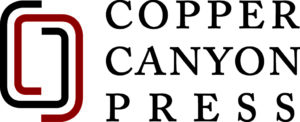
After several years of work and consideration, Copper Canyon Press is delighted to present its new pressmark, created by our longtime designer, Phil Kovacevich. We think it’s an incredible new representation of the Press:
This is a major milestone for us, a big shift in our identity just as we are about to celebrate our 50th anniversary. We had to take a deep breath to make this move. Many of our readers know, and some have loved, our legacy pressmark, which included the Chinese character for poetry, shī, a character composed of two parts that roughly translate as “word” and “temple.” For decades we found this beautiful instance of human language to be an apt portrayal of our mission as an independent publisher of poetry. In recent years, guided by our commitment to strengthen our diversity, equity, and inclusion principles, we came to understand that our use of this symbol had the potential for negative impact. We knew it was time to change.
We’ve worked slowly and methodically over years of intensive conversation among staff and board, with IDEA (Inclusion, Diversity, Equity, and Access) consultants, and with outside design and branding firms. This work culminated over the summer of 2022 with a presentation of pressmark options to select Press stakeholders. We asked attendees of this presentation to complete an anonymous questionnaire indicating their ranked selections along with the reasoning behind them. We examined what everyone had to say and made the choice.
We were looking for a pressmark that both honored our past and gave us a strong vision of the future. We think this pressmark does exactly that. Phil worked with the framing elements of our legacy pressmark, breaking it open and setting the lines in motion. We think it creates a sense of interaction as well as an open venue for the poems themselves. And you might notice a sly signature of our initials within it. This pressmark was the overwhelming selection among our stakeholder group, who used these words to describe it: nuanced, subtle, simple, clean, classic, symmetrical, layered movement, modern, timeless, graceful, unforced, playful, literary, and employs empty space. You can watch this short video to hear more from our designers and poets about the new pressmark.
We will say a heartfelt, complete goodbye to our legacy pressmark, and we will look forward to featuring our new one across all the spaces we inhabit: in and on our books, on our website (which may still show our legacy pressmark at the time of this announcement), in social media, in our publicity and exhibits materials, and, perhaps, on the occasional t-shirt or coffee mug. The very first place our new pressmark will appear is on our 50th anniversary anthology, A House Called Tomorrow: Fifty Years of Poetry from Copper Canyon Press, which will include this colophon:
Inspired by Copper Canyon Press’s legacy logo,
designer Phil Kovacevich has created a pressmark
that suggests entrance, connection, and interaction,
while holding at its center
an attentive, dynamic space for poetry.
It is hard, exhilarating work to enact a change like this. We hope, and believe, that we’ve done it the best way we can. What we learned in the process is what we’ve always known to be true about the poems we publish: it’s always a conversation, brought to life by differences of interpretation, with an aim of moving from the past to the future so we might be better, and better to each other. This new pressmark is one small part of that future.